Pragmatic Steering Wheel Design
- 10 min read
History and experience have already shown us which models, patterns and solutions work. And yet, for some reason, we often refuse to learn from them.
This is not only a software problem. It happens in hardware. It happens in cars. It happens in consumer electronics. It happens wherever people redesign something mature and decide, consciously or not, that a proven control model is boring and must be replaced by something more fashionable.
I work in the IT industry, but I have always been deeply interested in product design and comparative analysis: looking at many implementations of the same idea, finding the common patterns, identifying what works, and then asking why so many products still get the basics wrong.
In this article I want to focus on one of my biggest product-design frustrations: car steering wheel ergonomics.
A steering wheel is not a tablet. It is not a place for attention-hungry interaction. It is not a place for deep menus, ambiguous gestures, or controls that need to be visually decoded every time. It should be a low-attention, tactile, no-look control surface.
The design below is my attempt at a more pragmatic steering wheel control layout.
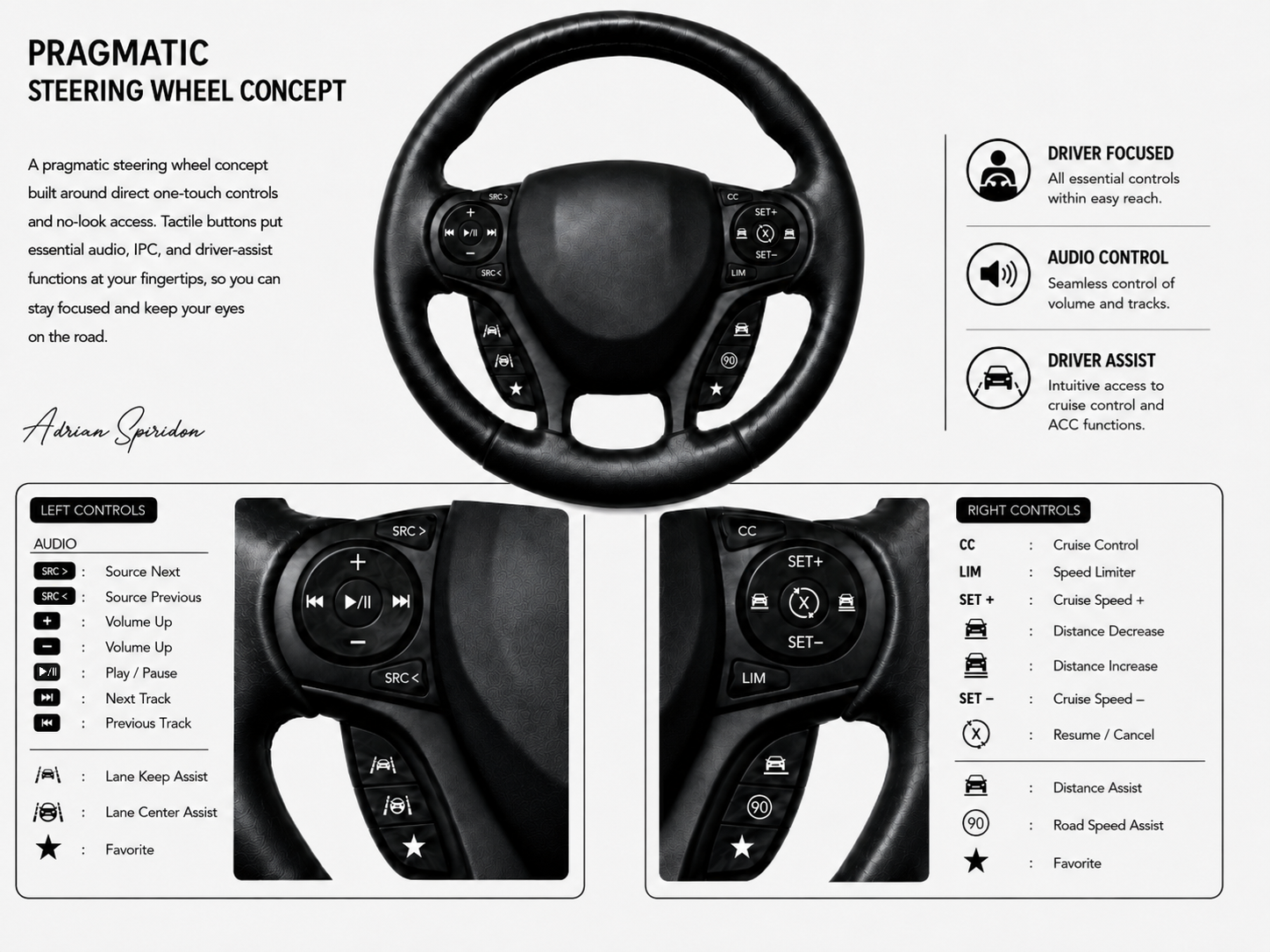
TL;DR
The wheel should expose direct one-touch actions, not menu-heavy interactions.
The upper-left area should handle audio.
The lower-left area should provide direct access to Lane Keep, Lane Center, and a programmable Favorite action.
The upper-right area should handle the two base longitudinal modes, CC and LIM, plus speed and following-gap adjustments.
The lower-right area should provide direct access to Distance Assist, Road Speed Assist, and a second programmable Favorite action.
D-pads are proven interaction models: vertical movement should mean one dimension, horizontal movement another.
Steering wheel controls should be understandable by layout, not by memorizing a manual.
The driver should be able to use the important controls with hands on the wheel and eyes on the road.
1. The core design rule: no-look actionable controls
My main rule is simple:
A steering wheel button should do something directly useful, with minimal visual confirmation and minimal cognitive overhead.
That means I do not want the wheel to become a small menu controller for the infotainment system. I do not want swipes. I do not want hidden modes. I do not want overloaded glossy surfaces where the driver must look down to understand what is happening.
The steering wheel should mostly contain actions that are useful while the car is moving:
adjust audio without looking;
skip tracks without looking;
cycle a small number of sources;
select cruise control or speed limiter directly;
set or resume cruise speed;
adjust adaptive following distance;
toggle Lane Keep;
toggle Lane Center;
toggle Distance Assist;
toggle Road Speed Assist;
invoke a small number of driver-configurable favorite actions.
The moment the interaction becomes a deep settings tree, it should move away from the steering wheel. Configure it on the main infotainment screen while stopped or while the interaction is safe; then keep the steering wheel for direct controls.
2. Left side: audio plus lateral assistance
The left side is intentionally split into two domains:
audio control, on the upper D-pad;
lateral driver assistance, on the lower three-button strip.
2.1. Audio D-pad
The D-pad idea has been confirmed again and again by the controller industry. It is simple, tactile and spatially meaningful. It lets the user build muscle memory.
So the audio D-pad uses the two natural axes:
| Control | Action | Reason |
|---|---|---|
Up / down | Volume up / volume down | Volume is naturally a vertical quantity: more or less. |
Left / right | Previous track / next track | Track navigation is naturally horizontal: backward or forward. |
Center | Play / pause | The central action is the main media action. It can also reasonably support mute as a long-press behavior, but the primary label is play/pause. |
This is the type of control that should not need explanation. The shape teaches the function. The driver can feel it. The driver does not need to read it every time.
2.2. Source cycling
Next to the D-pad are two source buttons:
SRC >— next source;SRC <— previous source.
This avoids a common mistake: mixing track navigation and source navigation into the same control.
A track is not a source. A radio station, Bluetooth audio, Android Auto, FM, USB, or another media input are different layers of control. They deserve separate actions.
2.3. Lane Keep, Lane Center and Favorite
The lower-left three buttons are dedicated to lateral assistance:
Lane Keep Assist;
Lane Center Assist;
Favorite.
The first two deserve separate controls because they represent different contracts with the driver.
Lane Keep Assist is reactive. The driver remains responsible for steering, while the car warns and, depending on the configured behavior, applies a brief corrective input when the vehicle begins to leave the lane unintentionally.
The exact behavior can be configured elsewhere as:
alert;
aid;
alert plus aid.
The steering-wheel button remains a simple ON/OFF control for the configured behavior.
Lane Center Assist is continuous. The car actively manages the lateral position within the lane, either around the geometric center or around a preferred offset configured by the driver. That is a materially different authority, so it should not be hidden behind a long press, a cycle, or a generic Lane button.
The iconography should reinforce the difference:
Lane Keep: a car between side markings;
Lane Center: a steering wheel between side markings.
The third button is a star-shaped Favorite shortcut. It deliberately remains generic, allowing one driver-configurable action without weakening the meaning of the dedicated controls around it.
Simple instrument-cluster card navigation can move to the turn-signal stalk, using an up/down ring and an OK button in the end of the stalk. That keeps the steering wheel focused on the controls that directly affect driving.
3. Right side: cruise control and modular longitudinal assistance
The right side is where the driving-related actions live.
This side should not compete with audio, phone, infotainment, climate, or random convenience buttons. It should be focused on the things that directly affect how the car drives.
3.1. Direct CC and LIM selection
The two buttons flanking the main right D-pad are:
CC— Cruise Control;LIM— Speed Limiter.
This is more explicit than cycling through a list of assistance modes. The driver does not need to remember whether the current position in a cycle is OFF, classic cruise, adaptive cruise, limiter, or an intelligent variant.
| Mode | Meaning |
|---|---|
| Cruise-control branch. The car controls longitudinal speed according to the selected target and active assistance features. |
| Speed limiter. The driver controls the accelerator, but the car prevents exceeding the selected ceiling. |
Manual driving is simply the state in which neither longitudinal base mode is active.
3.2. Cruise speed, resume/cancel and following distance
The main right D-pad has two dimensions:
| Position | Control | Meaning |
|---|---|---|
Top |
| Resume the stored target or increase the set speed. |
Bottom |
| Set the current speed or decrease the set speed. |
Left | Car with one line underneath | Decrease the following gap. |
Right | Car with two lines underneath | Increase the following gap. |
Center | Circular resume/cancel arrow with an | Cancel or resume the current cruise behavior according to the current state. |
This is important because adaptive longitudinal control has two separate dimensions:
speed — how fast I want the car to go when the road is clear;
distance — how far behind the vehicle ahead I want the car to stay when traffic is slower.
Many cars expose both dimensions because they are genuinely independent. You may want a high set speed but a long following gap. You may want the same set speed but a shorter gap in dense traffic. You may want to increase the gap in rain without changing the cruise speed.
That maps naturally to a D-pad:
vertical = speed;
horizontal = distance.
The distance icons also teach the function visually:
one line = closer gap;
two lines = farther gap.
3.3. Distance Assist, Road Speed Assist and Favorite
The lower-right three buttons are dedicated to longitudinal assistance:
| Button | Action | Reason |
|---|---|---|
Distance Assist icon — car with one line underneath | Toggle Distance Assist | Explicitly grants or removes authority to manage the relationship with traffic ahead. |
| Toggle Road Speed Assist | Allows the car to adapt the target or speed ceiling using road information. |
Star | Favorite | A configurable shortcut for another driver-assist function or preference. |
These are not random shortcuts. They are driving-context controls. They belong on the right side because they change how the car behaves while being driven.
4. The ADAS model behind the buttons
The layout is based on a simple distinction between base modes and assistance authorities.
The base mode answers:
Who controls the basic longitudinal behavior?
The assistance buttons answer:
Which additional authorities do I grant to the car?
The two base modes are:
CC;LIM.
The four assistance authorities are:
Lane Keep;
Lane Center;
Distance Assist;
Road Speed Assist.
This creates explicit combinations instead of opaque commercial bundles.
Examples include:
CC + Distance Assist;CC + Distance Assist + Road Speed Assist;CC + Distance Assist + Lane Center;CC + Distance Assist + Road Speed Assist + Lane Center;LIM + Road Speed Assist;LIM + Distance Assist + Road Speed Assist;Manual + Lane Keep;Manual + Lane Center, where the implementation allows independent lateral control.
The driver should not need to know that one manufacturer calls a bundle Traffic Jam Assist, another calls it Active Driver Assist, and another calls it Travel Assist. The wheel should expose the actual ingredients.
4.1. Why Lane Keep and Lane Center remain separate
Lane Keep and Lane Center are often presented as if they were variations of one function. They are not.
Lane Keep means:
the driver performs the main steering task;
the car reacts at the edge of the lane.
Lane Center means:
the car continuously manages lateral position;
the driver supervises and can override.
Because the authority is different, the buttons should be different.
4.2. Why Distance Assist is independent
Distance Assist is not merely a hidden ACC setting. It represents a clear authority:
The car may reduce speed, brake, stop, or follow traffic according to the selected base mode and current conditions.
In CC, this naturally creates adaptive cruise behavior.
In LIM, it can provide traffic-aware deceleration while the driver still controls acceleration.
The exact envelope is an implementation decision, but the authority should remain explicit to the driver.
4.3. Why Road Speed Assist is independent
Road Speed Assist represents a different authority:
The car may adapt the speed target or limiter ceiling using information about the road.
Its configured sources may include:
speed signs;
map and geographic data;
online information;
curves;
ramps;
roundabouts;
intersections;
other road-context data.
Those are configuration details. The physical button remains a simple, stable ON/OFF control.
5. The bigger product-design lesson
The specific button layout matters, but the bigger lesson is more general.
Good product design often comes from comparative analysis:
look at many implementations;
find what keeps reappearing;
separate proven patterns from fashion;
understand why users make mistakes;
remove unnecessary cognitive load;
make the obvious action easy.
In software architecture, we often see teams ignore known patterns and rediscover old failure modes. The same thing happens in car interiors. A manufacturer may add more technology, more screens and more visual drama, while making basic controls harder to use.
That is why I call this a pragmatic design. It is not trying to be futuristic. It is not trying to impress through novelty. It is trying to make the useful actions obvious, tactile and reachable.
The driver should not have to negotiate with the interface. The driver should drive.